As the vacation rental property industry continues to explode, it’ll take marketing savvy to ensure your vacation property stands out. Whether you’re a property manager with an extensive portfolio or a homeowner renting out your second home, having the right vacation rental company logo can significantly influence the effectiveness of your marketing strategy.
Here’s why.
Why a memorable rental company logo is important
While you may not have thought about investing in a logo, it’s an essential part of your overall branding.
Here are a few important reasons to consider a vacation rental brand logo :
- To quickly communicate your company’s aesthetic
- To create a sense of brand identity for your guests to relate to
- To grab attention in an environment where people’s time and attention are limited
- To stand out from another property management company or vacation rental company
In many cases, a logo is the initial point of contact in the sales funnel for vacationers searching for the perfect accommodation.
What goes into creating a memorable rental vacation logo?
A great logo has at least three critical elements that will need to be considered to represent your vacation rental company well. Color, font, and versatility.
When you’re designing your logo, remember that the choices you make here will have an impact on your overall branding. The advice below goes both for vacation rental logo design and your overall look and feel.
Choosing the right color
Consider how you’ll use your new logo on your invoices, digital guidebooks, contracts, or even as a watermark on your property images. You need to make sure the colour you choose won’t take away from any of the places you may place it. It’s also important to consider how your vacation rental logo will look in black and white because it’ll often be printed in reports or on printed material (often on white backgrounds).
From there, choose colors that will carry you throughout the years as your company grows. You’ll want to create a document that looks like this:
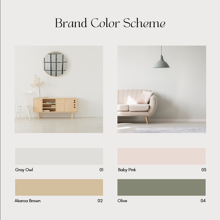
Need some color inspo? Here are four places to look:
- Start with the home decor color palette in one of your properties. Keep in mind if you have a beach house, you may want to go with a palette that has a more “easy – breezy” type of vibe, but if you are the owner of rustic log cabins, you may want to choose warmer earthy tones.
- Use Canva, a free graphic design platform that already has tons of branding palettes put together by designers.
- Search branding color palettes on Pinterest.
- Then there’s Google. Simply type “brand color palette” or “logo color palette” and you’ll have pages and pages of inspiration. A lot of what’s on Google was curated by expert designers. So if you end up choosing a palette of colors you can be confident that they will work well with another.
Choosing the right font
If you want your logo to include your company’s name, you’ll need to choose a font that fits your branding. The number of fonts to choose from is endless, which can make choosing the right font for your rental logo overwhelming. When you’re deciding which font or fonts to go with, here are a few questions you’ll want to think about.
- Is the font legible? For example, a beautiful thin script can read very luxe to your client but won’t have the effect you’re looking for if they aren’t able to read it. Remember, you want your logo to stand out, and you’re vying for attention; if it takes effort to sort out the name on your logo, you’ll lose your audience’s attention.
- What does the font type say about your brand? You’ll want to consider the typography of your fonts. Different styles communicate information differently. For instance, a font that looks like hand lettering can be associated with an artist or a child, depending on how it looks. With a more angular, structured font, the vibe will communicate a more edgy or modern branding. Do you have an old classic home? Then you may want to choose a nostalgic font that is associated with days gone by.
- Does your font choice(s) appeal to your ideal guest? One way of figuring out what fonts resonate with your ideal guests is to have a good understanding of who they are. When you have a good idea of your client’s demographic, you can begin to look at where they shop and what brands they support. Chances are you’ll see a theme in the branding of those companies. They may prefer clean, simple fonts or something more traditional. Take a cue from there to help you find your new logo inspiration.
Aside from your primary font, you’ll want to select a second one that you will use in the rest of your branding experience (ie on your direct booking site). You’ll need one font for your logo that you can also use for headers, and a second one used for regular text. Now the question is, how do you select your vacation rental company’s font package? Luckily, the internet has tons of inspiration when it comes to typography. A quick Google search for “font pairings” will reveal many different combinations.
Note that when selecting fonts for your logo, also make sure that this font is commonly used. The reason behind this consideration is for when you’ll eventually build your direct booking site. If you select a font that’s not commonly used, site visitors’ browsers will have to fetch and load it. This will increase your page speed loading times, which can impact the visitor’s experience and ultimately how often you convert into reservations.
The logos versatility
Of course, you’ll want a “cool” looking logo. However, before you get attached to any design, you have to consider all the various ways you’ll be using your logo and how it will translate.
Here are a few questions to ask yourself when picking your design:
- Is it scaleable?
- Does it look good in black and white?
- How will it appear in different contexts? I.e., a sign, an invoice, a mug etc.
- Does it match your targeted guest persona?
Types of logos to choose from
To make your journey towards the perfect logo for your rental company less overwhelming, you’ll also need to decide what type of logo will best communicate your brand’s aesthetic, value and messaging.
When it comes to vacation rentals, there are four main logo categories you can choose from to narrow down which design direction you’d like to go:
Minimalistic
A minimalistic approach to your logo means that you’re choosing to keep it simple. The design will be straightforward, clean, and clear.
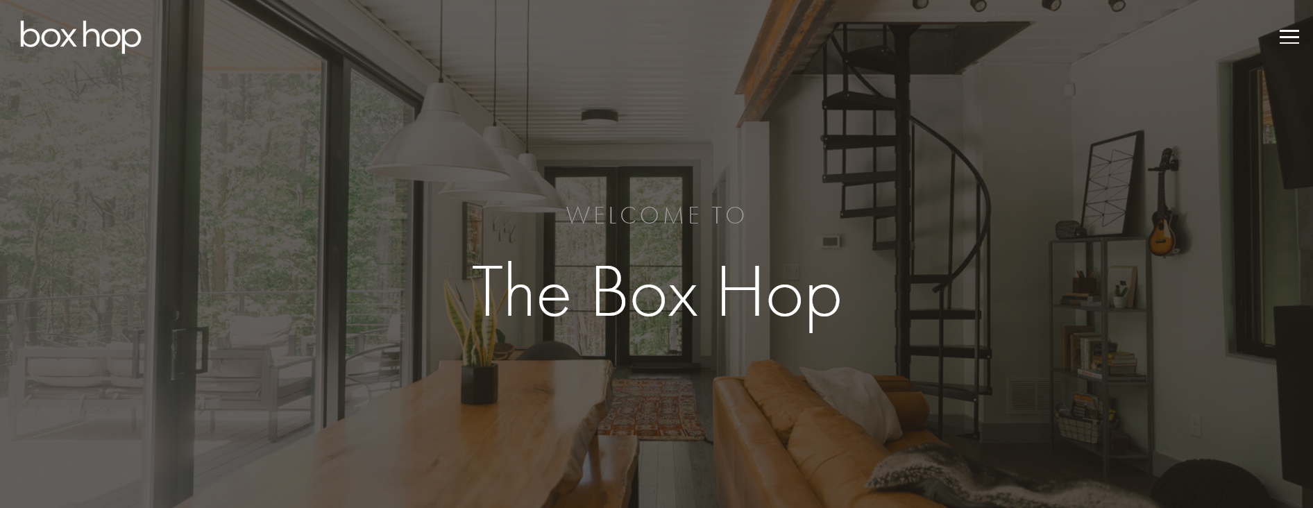
Example: Box hop is a cabin rental company from Hocking Hills, OH. Their logo is the perfect example of minimalistic design. They pride themselves on their simplistic approach to modern design, and their logo embodies that aesthetic with its clean and structured font. Choosing a font in white also speaks to the simplicity and timelessness of their design and translates perfectly for their social media accounts, direct website, business cards and anywhere else they advertise.
Traditional
Taking a traditional approach to your design means that your design will be more literal. It’ll be clear to your audience how your logo relates to your vacation property and can incorporate not only an image but also words, making the messaging very clear.
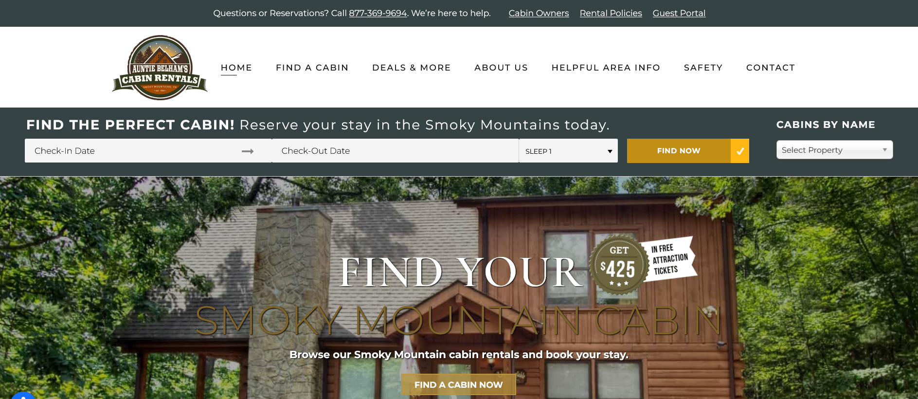
Example: Auntie Belhams Cabin Rentals in Gatlinburg, Tennessee, accomplishes this beautifully by incorporating a mountain range in the background of their logo and using a rugged, wooden-looking font to display the name of their vacation rental property company clearly. When you see their logo, you gain a clear idea of what kind of properties they offer and the landscape of their location.
Abstract Graphic
Choosing an abstract graphic design means that you’re selecting a symbol representing your brand. Less literal graphics are great options if you’re interested in printing them on merchandise or using it in a wide array of marketing materials.
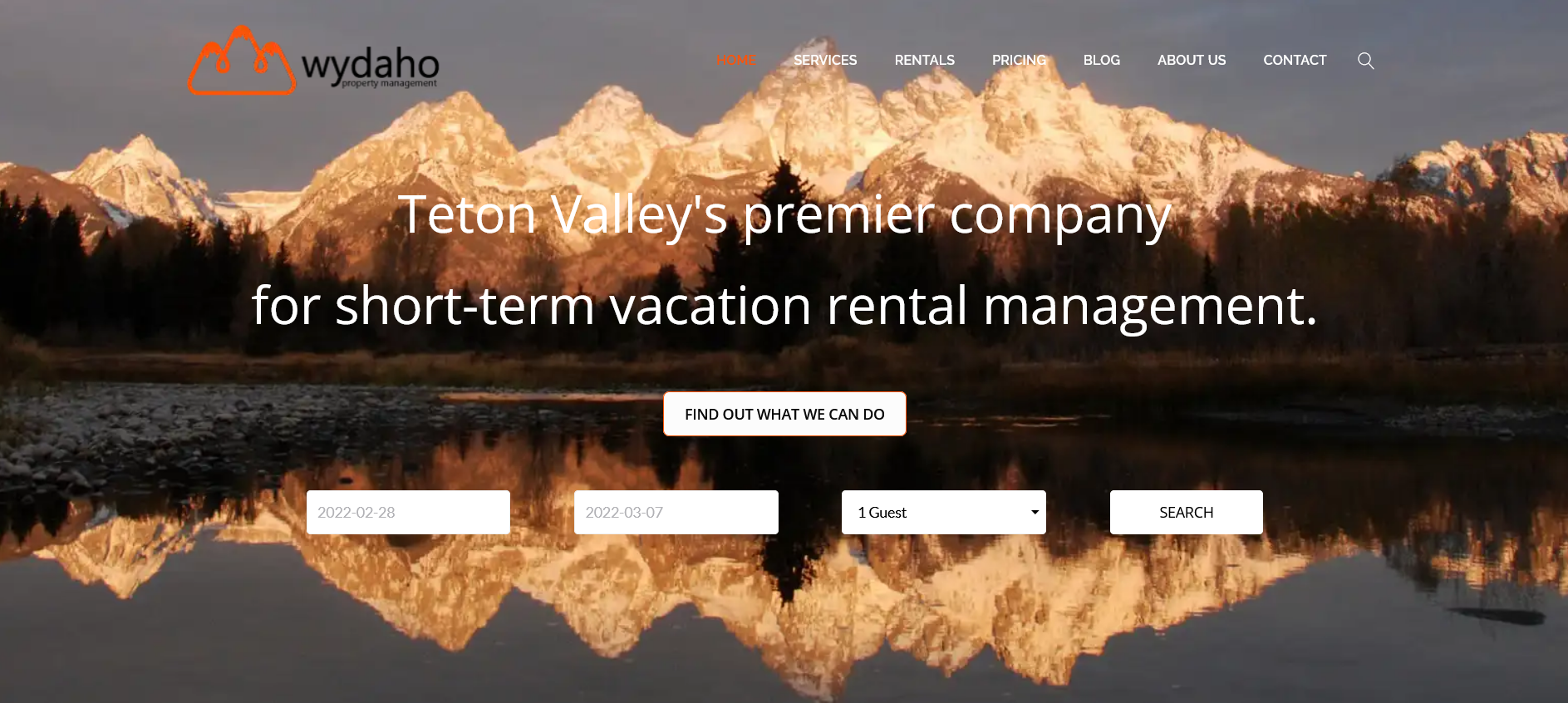
Example: Teton Valley’s premier short-term rental property management company, Wydaho properties, did this beautifully with their abstract take on a mountain range in a stand-out color of burnt orange. This symbol can be used repeatedly to gain brand recognition and does a great job communicating a more luxurious vibe than a graphic with a more cartoon aesthetic.
Hybrid
A hybrid logo is a symbol and wordmark representing your vacation property company. The benefits are that the words and the symbol can be separated and still be recognizable. A famous example of this type of logo is the Airbnb logo. The emblem and the company name can stand alone and work beautifully together.
Example: Cuevas Helena Holidays is located deep in the Andalucian countryside in Cuevas De Luna, Spain. They chose to combine both the initials of their company name in their brand colors and their full name. This design choice gives them the flexibility of brand recognition from both their initials and their rental property management name.

3 actionable steps to getting your own vacation rental logo
Now that we’ve covered the main elements of a logo and the different categories of logos to choose from, it’s time to create your new vacation property logo. These 5 steps will help simplify the process so you end up with a logo you can be proud of regardless of your budget.
Step 1: Determine the look and feel you want for your rental logo
The way to determine this is to look at the types of properties you offer. Are they luxury accommodations? If so, you may want to go with a sleek, minimalistic design with a single color.
Is your property more of a country rustic feel? Then you may want to consider going the more traditional route and choosing a color palette that reflects the coziness and warmth of your home.
Step 2: Create an inspiration file
After choosing your logo style, it’s time to do your research. You can use sites like Pinterest or just plain old Google images and search terms like “best abstract logos” or “most famous modern logos.” Take the time to see which ones resonate with you and save them to your inspiration file.
Once you’ve collected 10-20 images, take a look and see the recurring themes you are drawn to and make a list of the repeated design elements you see. We bet you’ll begin to see a pattern that will help you in your design direction.
Step 3: Design your logo
You can explore a few options at different price points to get the best vacation logo for your company.
- The DIY option: If you’re looking to spend as little as possible on the logo creation process, we recommend the incredibly popular and free graphic design site Canva. They offer logo templates for inspiration that can easily adjust to your company name and brand colours.
- Budget-friendly options: To benefit from a wide array of designers, you can try out sites like Fiverr, which is quite inexpensive. The downside is you may find that the quality of the work is inconsistent and not the level that you’d receive from a marketing agency or an established graphic designer. One proven strategy on a platform like this would be to hire a few graphic designers and see which logo you like best.
- Mid-scale options: Upwork is another option that can be easy on the pocketbook. It’s a large marketplace of creative professionals that can be overwhelming, but if you take the time to look through portfolios and clearly explain what you’re looking for, you could end up working with a talented designer at a competitive rate.
- Mid-scale to expensive option: Finally, another way to design your logo is through crowdsourcing sites like 99designs or Design Crowd. These allow you to put your creative brief out to multiple designers that will compete for your business with their design, providing you with a lot of variety to choose from.
- Most expensive option: Alternately, you can choose to work with an established graphic designer. The best way to find a graphic designer is to ask for recommendations from other small businesses with branding that you admire and book a discovery call with them to discuss your needs and budget.
The final take
Creating a logo can seem overwhelming, but if you follow the simple steps we’ve laid out in this guide to determine the type of logo best that’s best for you, with the right color and designer, you can have this critical marketing element nailed down and ready to launch.


